Apparell
WebApp Dashboard
Evolution of Apparell's webapp analytics into a fully featured dashboard, from user research to final product.
Role
UX/UI Designer, UX Researcher
Year
2025

Overview
As part of a full company rebrand, Apparell's WebApp underwent a complete redesign. In the previous version, analytics was a simplified view integrated into the Home screen. For the new version, I was involved in both the research and design process to separate it into its own dedicated section and expand it into a more detailed and comprehensive Dashboard.
What's new
Compared to the previous version, which only displayed basic sales and visitor data, the new analytics introduced a broader set of metrics. As a B2B platform for musicians and record labels, data about product performance, artist sales, traffic sources and order distribution were added, reflecting the specific needs of users.
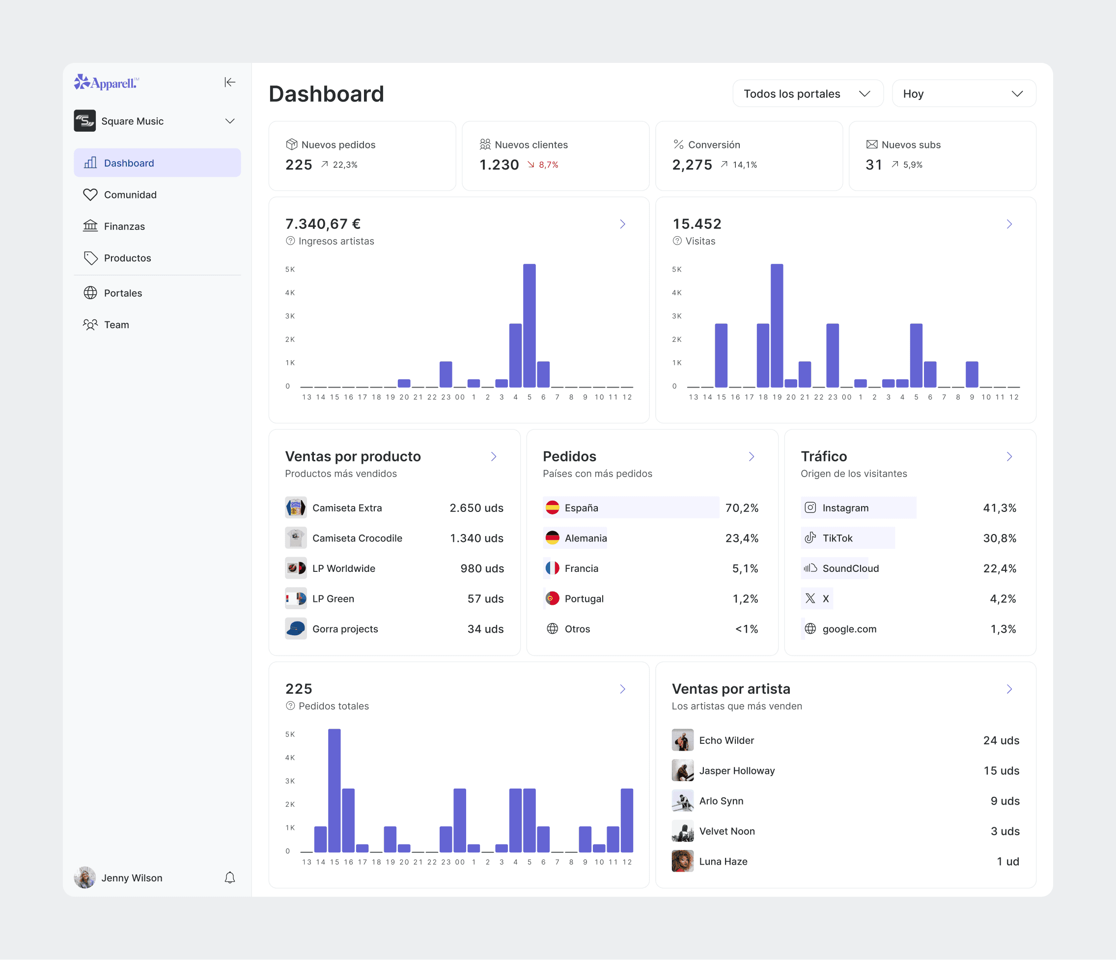
Each metric card includes a detailed view where users can explore the data further, apply filters and export it as a CSV file. This last feature was particularly important, as many users needed to share and manage their data outside of the platform.
Sales by product was by far the most visited detailed view, reflecting the importance of product performance tracking for musicians and record labels.

From Analytics to Dashboard
Initially, Home and Analytics were separate sections of the app. User research revealed that the Home screen was largely ignored and that users logged in and navigated directly to Analytics, ignoring many of the Home features. Interviews confirmed that users perceived analytics as the most important part of the platform and the area where they wanted to see the most growth.
Based on these insights, it was decided to rename Analytics to Dashboard and make it the default screen upon login, integrating the most relevant features from the previous Home screen.

Improvements
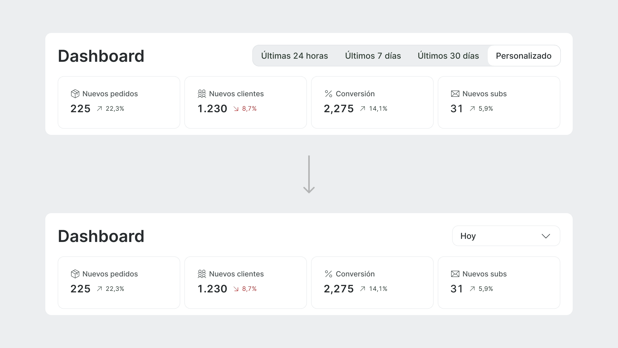
The Dashboard was designed to be iterative and responsive to user needs. Following initial feedback, two key improvements were introduced: a refined date filtering and a portal selector.
Users found it difficult to understand what time period the data corresponded to. The previous design relied on button toggles to switch between date ranges with a separate option triggering a date picker dialog, a combination that proved confusing for users. By default, the data also showed figures from the previous day rather than the current one, which added to the frustration.
This was solved by replacing the toggles with a select component that opened the date picker as a dropdown, making the selected period clearer. The default view was also updated to show current day data.
For record labels, the dashboard initially displayed data from all their artists without making this clear to the user. Label managers reported that beyond seeing the combined data, they also wanted to be able to filter by artist.
A portal selector was introduced to address this. Users can now see at a glance which data the dashboard corresponds to and switch between a full overview or a specific artist, with the dashboard updating accordingly.

Next steps
User feedback pointed to a desire for greater personalisation of the Dashboard. Users wanted more control over what they saw and how it was arranged, two features that were explored but not yet implemented.

Conclusion
The Dashboard was the most important section of the app for users, something backed by research from the very beginning. Its reception after launch was extremely positive, surpassing other sections that we originally expected to perform better.
However, not all parts saw equal engagement. Some detailed views received very little interaction, with many users not even paying attention to them. This highlights the need for more extensive user research in future iterations.
This project taught me a lot about the importance of understanding user needs and translating them into meaningful design decisions, as well as the challenges of designing for data-rich environments.